
In the meantime, I hope that by sharing my experiences here I will be able to provide as much help as possible for those artists who are also transitioning from student to professional.
Life Lessons Learned at ACC-Baltimore
1) Pricing. Do your research before pricing your work and be aware that your pricing might be different depending on the show you are in. The best advice I was given upon arrival came from Sayaka Suzuki, a fantastic artist and teacher in the glass department at Virginia Commonwealth University. She said, "Walk around the show, look for other artists displaying work similar to yours and observe their price points." I did this and discovered my work was priced painfully low. I had never displayed my work at an ACC show before but I knew other people who had and yet, due to time restraints, I failed to ask for their advice on my pricing. Don't be like me! Use all your available resources including other students.
2) Business Cards. Bring twice as many business cards than you think you'll need. Don't underestimate your work. ACC- Baltimore saw thousands of people this weekend and I spoke to a few artists who had run out of business cards by midday Sunday. Try to avoid that situation. Better to go home with loads of cards (your own and others) than to miss networking opportunities.
3) Appearance. You go to these events to meet people, widen your net of opportunity, and show your work to a large audience. You are promoting yourself because, as an artist, you are in fact part of the product package, (whether we like it or not). You're not just trying to show and sell your work but you're on display too. People always want to talk to the artist of the work being shown. Dress professionally but maintain your own quirky personality and flair. You want to still feel like you but in clothes you would never dream of wearing to the studio.
4) Display. There are so many creative ways to show your work. Some booths were set up like small galleries, some were set up like shops, and some were shared by two artists which displayed their work together or had split the designated space. Below is a sampling of the booths at ACC- Baltimore. Make sure to check out the artists websites!
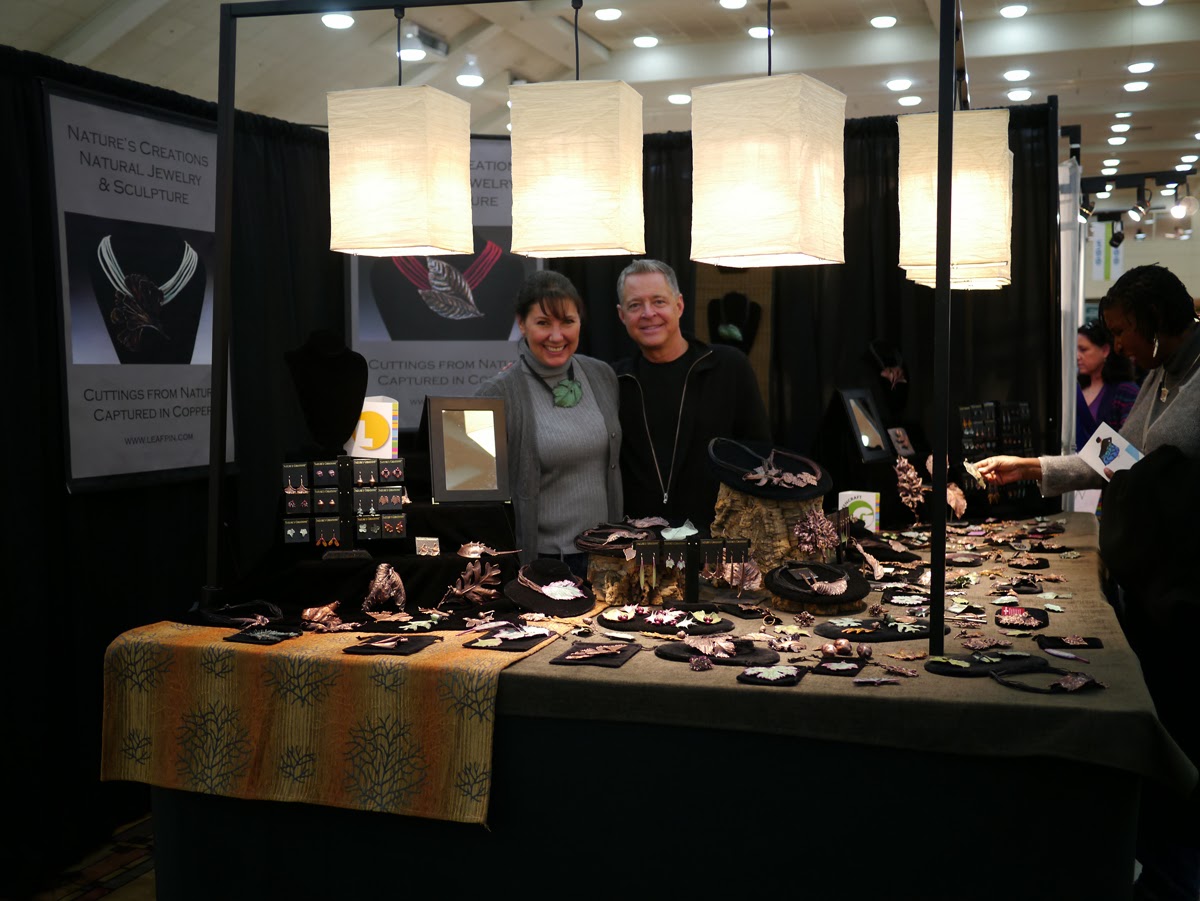
What I thought was great about Dennis' display is that he had lots of pieces scattered over his tabletop much like real leaves would cover a surface. His corner booth felt open and inviting too.

Julie's booth struck a nice balance between on display and in the display case. It felt very professional and as you can see she had large banners attracting customers from a distance. I noticed that quite a few jewelers were employing this tactic and it did seem to draw in more customers.

Kyle's booth had these great shelves which were just the right size for the work he was displaying. Because of the white walls and the decent lighting the booth felt very much like a small gallery space. Kyle was also full of awesome pricing tips (as was his wife who told me if she can afford my work I'm not charging enough)!

I was lucky enough to get to booth sit a little for Shelly. As you can see she has two types of display cases. She told me she's going to transition so that she's only using the plexi case (on right) as it is much lighter than the wood and glass case (on left). I also think it makes the space feel more open. She only keeps a few necklaces, bracelets and pins outside of the cases. She makes these fantastic olive and acorn pins which she leaves out on a display plate but she's found if she leaves more than three out they tend to walk off.

I absolutely love the way Becky and Steve showcase their work. I've seen a couple instances at previous shows where artists have priced their work appropriately but because of their booth's slapdash appearance no one wants to pay up. If you display your work like you believe in it's worth people will pay the asking price, which is exactly what Becky and Steve have done. The color is great for displaying black and white work and I love the backlighting on their pottery. The small nook in the back left corner is also a nice touch because it allows for a booth sitter/ the artist to maintain a watchful eye without obscuring the customers view of the work.

And here we are! VCU's fantastic booth that was designed and put together by the Handcrafted Entrepreneurship class led by Sayaka. Sunday shift workers from left to right : Ginny Rush, Lora Price, Me (I wasn't working though) and Sayaka Suzuki. I think the Handcrafted Entrepreneurship class did a really lovely job. The booth feels open, warm and inviting.
5) Stay close and visit for the whole weekend. If you're traveling to the Inner Harbour in Baltimore I highly recommend the Day's Inn. My finance and I were both unlucky enough to have lived through two separate bed bug infestations and the Day's Inn was one of the few hotels without any reports of the wretched things. It was also very clean, beautifully designed, convenient (only a block away from the convention centre, validated parking and free wifi) and had a great little restaurant downstairs.
The best part about going to these types of events is that it really gets you motivated. You leave and your whole body is tingling with excitement about getting back into the studio, which is where I'm headed now.


